

“Free Radicals is one of those rare partners that think strategically, execute beautifully and systematically, while always focusing on helping our brand grow.”
Shauna Spenley
Chief Marketing Officer


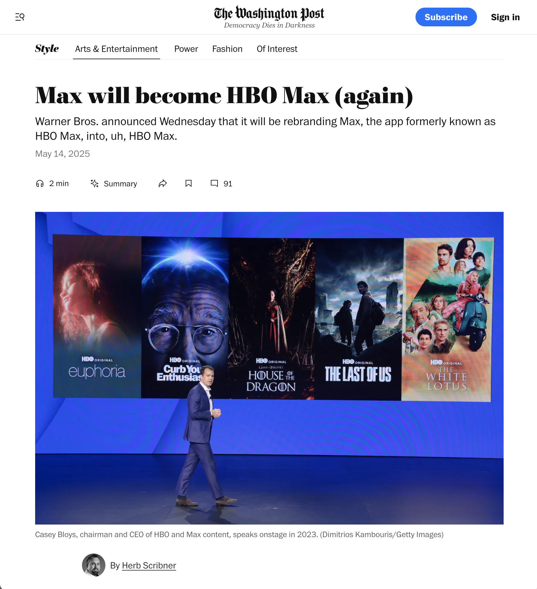
When Warner Bros. Discovery approached us, they were in the midst of a difficult decision. Consumer data revealed a clear insight: consumers overwhelmingly subscribe to Max for high-quality HBO content. Leadership had a choice to make: save face and stick with MAX, or make the reversal back to HBO and give the people what they want. Fortunately, with a bit of persuasion, they chose the latter and asked Free Radicals to develop the creative strategy, brand identity system, and global rollout plan.
Act I
Going back… to the future.
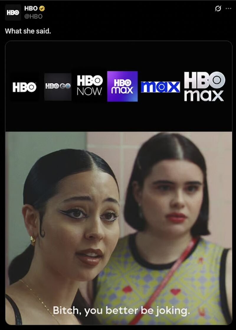
For streaming networks, MORE IS BETTER. They want disposable, fast-food entertainment for everyone. Quantity beats quality, so Warner Bros. Discovery launched Max as a standalone brand, dropping HBO and cramming their entire catalog into one cluttered mess. Pretty crazy.
In our opinion, Max's strategy backfired—tanking viewership, brand erosion, and confusion. They suffocated the golden goose and alienated consumers who came for HBO's content. We aimed to define what makes HBO "quality" because, ultimately, BETTER IS BETTER.

The brand’s competitive edge lies in its legacy and continued commitment to crafting the highest quality entertainment.
HBO Max is a values-driven promise, consistently delivered at every touchpoint.
HBO Max.
LEGACY
ART-DRIVEN
CURATED
SUSTAINED QUALITY
CULTURE-MOVING
LEADING
SHARP
Others.
NOVELTY
TECH-DRIVEN
BIG BOX
HIT AND MISS
DISPOSABLE
FOLLOWING
UNFOCUSED

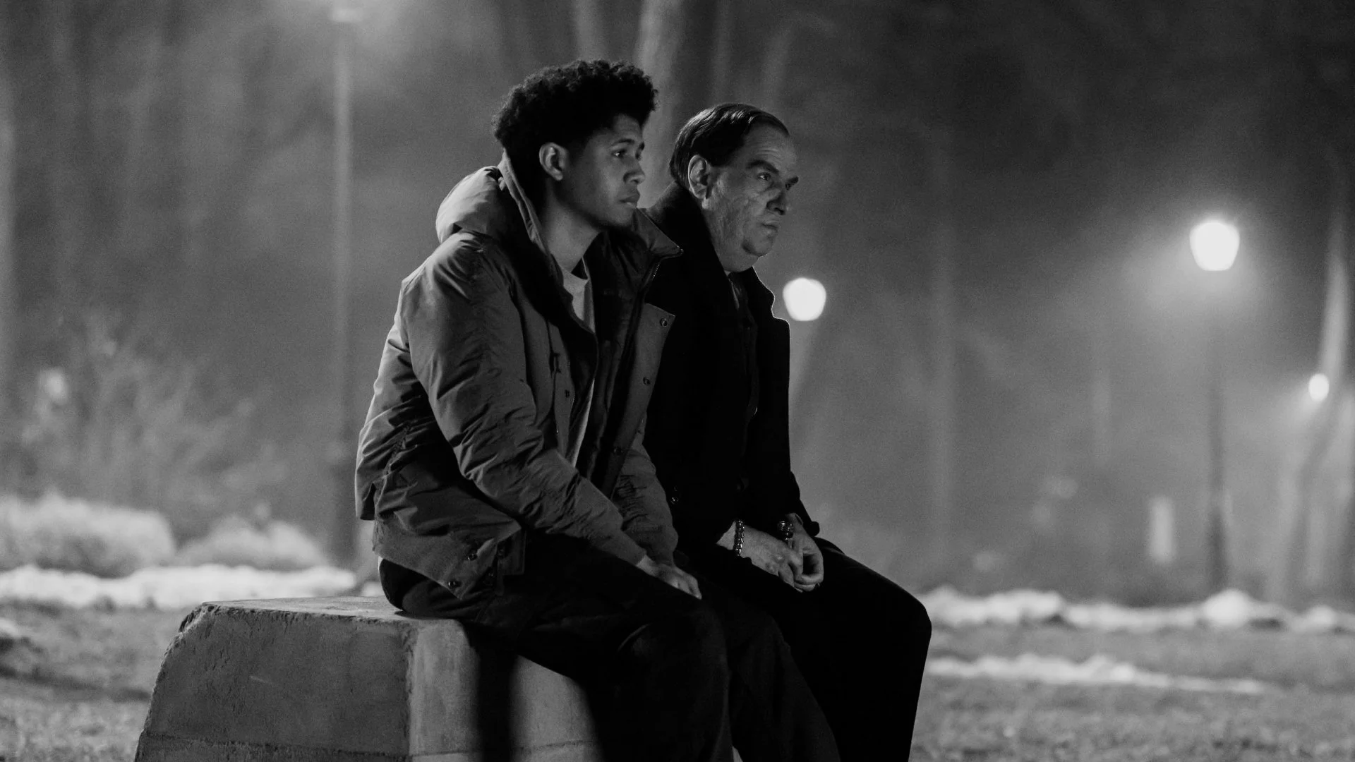
HBO Max differentiates itself through quality, exemplified by its signature, complex, layered storytelling. Mind-blowing plot twists and misdirections, like the Red Wedding or the Sopranos' ending, create culturally resonant, WTF moments that keep audiences thrilled and anticipating more.
Act II
THE HBO-IFICATION OF MAX.
Moving from ideas to execution, we infused HBO's DNA into Max to extend the brand's halo and elevate the perception of quality entertainment.
The result is a confident minimalism that lets best-in-class content shine without interference. Inspired by premium luxury rather than outdated studio models, the brand identity distinguished Max in the crowded landscape while creating an infinitely functional system, setting the stage for HBO's return.
CONCEPT 1:
GLASS


CONCEPT 2:
IN CHARACTER


CONCEPT 3:
THE CLOSE-UP


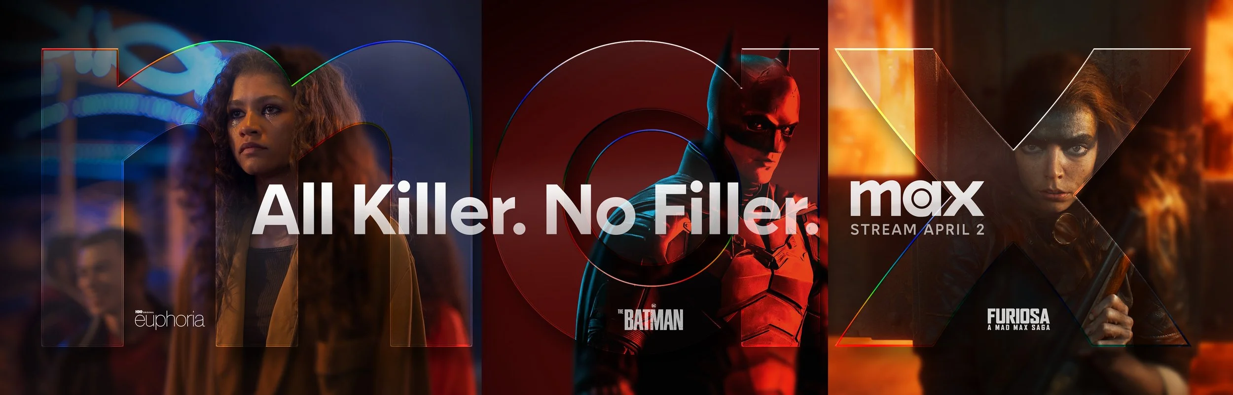
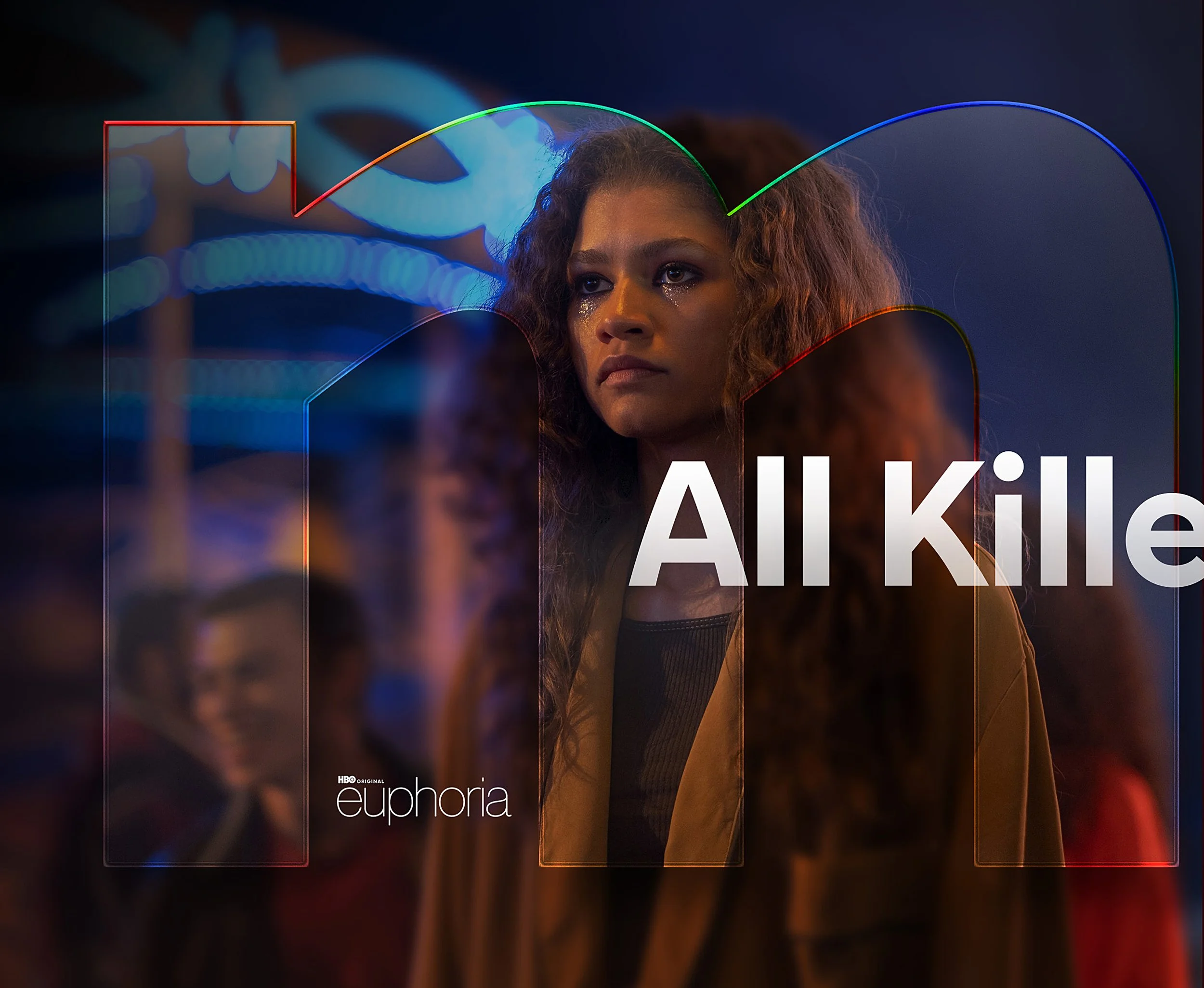
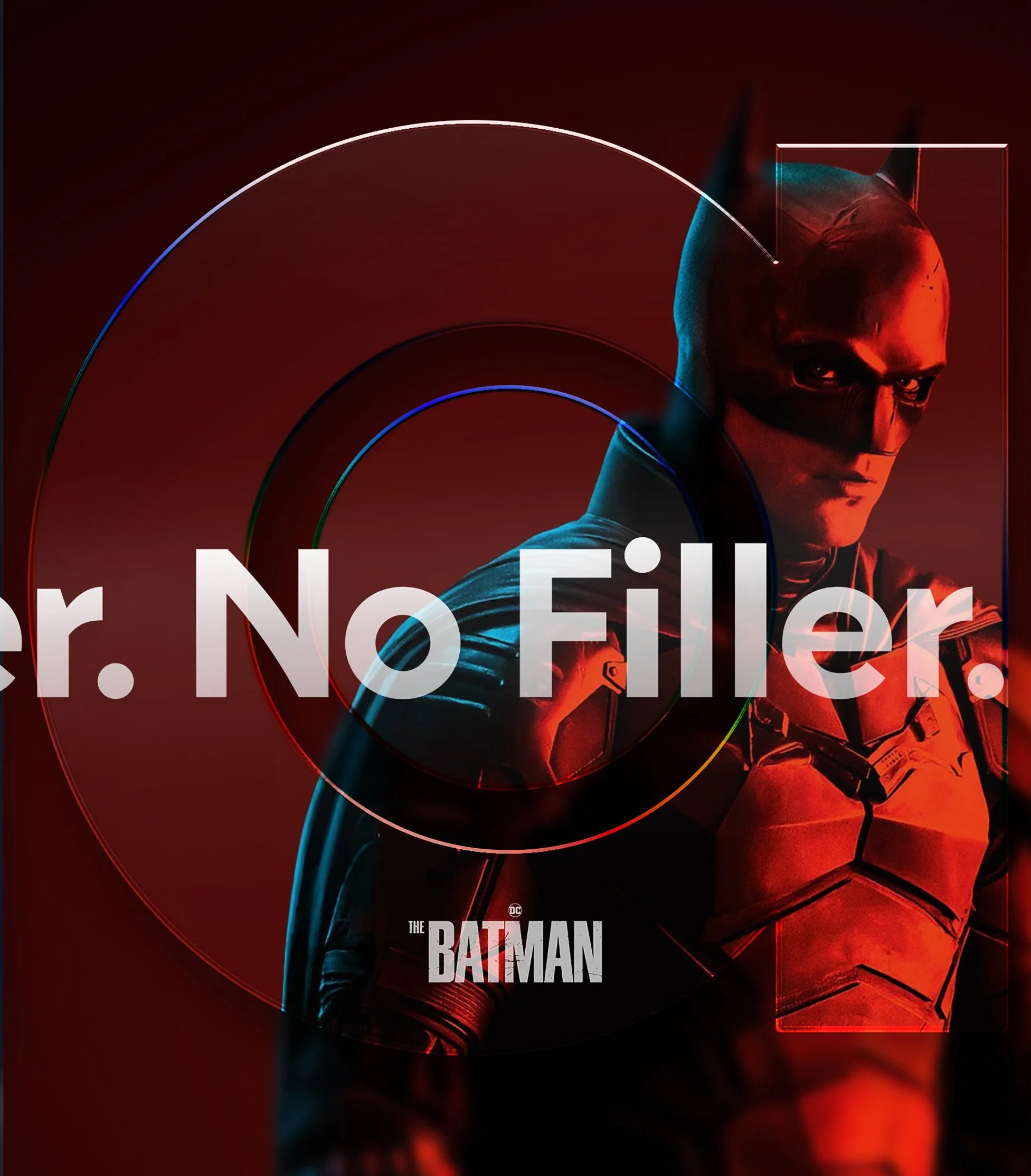
The new design works like a lens—the logo becomes a window into the best moments. The content and art take center stage to tell the story, not buried under distraction.
We borrowed from iconic filmmaking: light, glass, depth, blur. All to accentuate HBO Max’s quality storytelling. Great stories thrive in great characters and captivating moments, while great brands highlight aspects that only they can own.

COLOR.


HBO Static Grey
Max Cobal Blue
+
=
Medium Slate
We synthesized Max and HBO's visual identities through thoughtful color theory, creating a refined palette that preserves brand equity while conveying cinematic sophistication and premium positioning.
A moody, Luxury-inspired color palette.

White Hot
True Black
Mid Slate
Deep
Lite
UNIFYING content with brand.


Act III
BRINGING HBO back where
It belongs.
HBO Max's rebrand puts their unparalleled stories front and center.
While other streamers focus on creating disposable, mediocre entertainment for everyone, HBO Max is committed to delivering high-quality, mind-blowing, and engaging entertainment that keeps you talking long after you've finished watching. It's about substance over quantity—content that doesn't just fill time but creates cultural moments.
HBO Max distinguishes itself by curating experiences rather than cramming catalogs, proving that in a world obsessed with more, often BETTER IS BETTER.


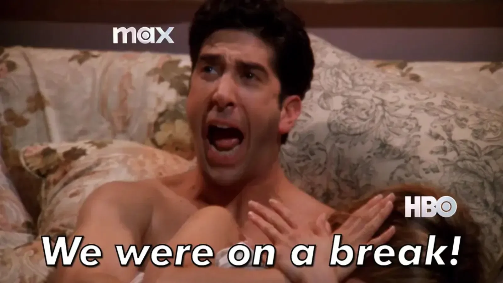
EPILOGUE:
THE INTERNET GOES APESHIT, AND HBO MAX JUMPS right IN.


NEXT /