“When we started our business, we thought we knew what a brand was or could be. Then we met Free Radicals, and they’ve transformed our brand, business, and trajectory to help us scale for long-term success.”
Ashton Bailey
Co-Founder


The Grind House team has ambitions to expand their gym business beyond their Brooklyn roots, starting with a significant investment in the Flatiron district of Manhattan. The founders approached us with the keen awareness that their gym needed a stronger identity to differentiate them in the highly competitive NYC market, and beyond. The vision, strategy, and brutalist brand system deliver distinction by capturing the raw energy of NYC’s most uncompromising gym and expressing it across all consumer touchpoints.
CUTTING THROUGH ALL THE FITNESS NOISE.
Grind House shatters the "fantasy fitness" illusion by offering what the industry won't — authentic physical transformation through intense effort. While luxury fitness brands seduce with spa amenities and effortless results, we stand apart with our uncompromising focus on rigorous, results-driven training. This deliberate contrast positions Grind House as the definitive choice for those who understand that meaningful physical change demands genuine work, creating clear differentiation in a market drowning in empty promises.


We carved out a distinctive market position between high-end luxury gyms and budget options by emphasizing quality equipment and community while rejecting "selfie squads" and overcrowded conditions. This strategic middle ground appeals to serious fitness enthusiasts, who are overlooked by both market segments.


STRENGTH IN SIMPLICITY.
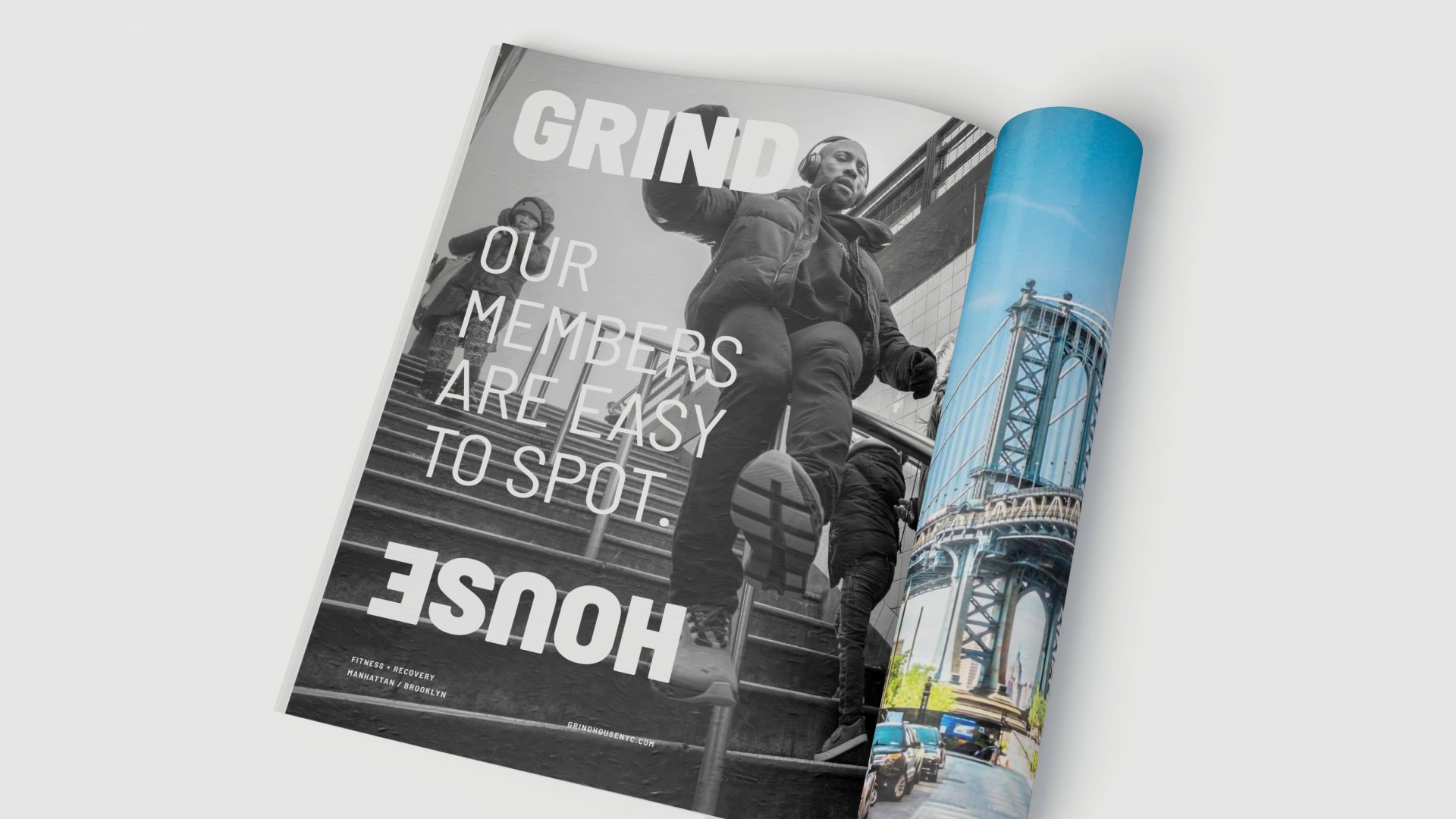
The vast industrial space of Grind House inspired our design approach – an ultra-minimalist wordmark that embodies their no-compromise training philosophy. The visual identity features a deliberately stark palette of slate, ice, stone, and fire red, reinforcing the raw, industrial environment where serious physical transformation happens. This austere aesthetic communicates what Grind House delivers: the essential space and tools for optimal fitness performance without distractions.


FUCK THE HYPE. EMBRACE THE GRIND.
Grind House's distinctive voice and visual identity remain forceful across all touchpoints—digital ads, social media, email, print materials, physical space, and merchandise. This deliberate consistency doesn't just build brand recognition; it stands as a visual manifesto against the fitness industry's hollow promises. Grind House's unwavering visual approach reinforces what members experience in a market flooded with empty claims: authentic results through genuine effort.


Fuel.
Insight: The fitness industry has split between luxury spa-like gyms and overcrowded budget options, neglecting serious enthusiasts who value substance over status. We identified a growing segment disillusioned by "fantasy fitness" promises who seek authentic spaces that honor commitment and reward genuine effort.
Spark.
Grind House was the defiant middle ground, combining neighborhood gym authenticity with high-performance equipment. The "for anyone, not everyone" platform filters for mindset rather than demographics, deliberately rejecting industry conventions to establish Grind House as the antidote to luxury superficiality and budget compromises.
Fire.
We created a distinctive identity system with a stark slate, ice, stone, and fire-red palette supporting provocative headlines and imagery. Environmental elements, progression-based membership identifiers, and community merchandise transform the brand from concept to lived experience, appealing to those who value earned achievement over purchased status.